
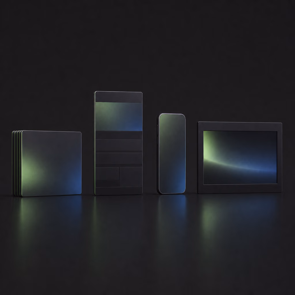
You open an empty tool and in under two hours you walk out with a finished brand: a logo, an investor pitch deck, a website with an animated background, a clickable app prototype, and a short promo video — and at the end the site is live on the internet at a real address. That's what I'll teach you here, step by step. I'll show you the whole road using a single company invented from scratch, and the whole time I'll keep an eye on the one thing that decides whether you reach the end at all: the session limit. The map is simple — first the foundation, the brand system; then the four things you'll build; then publishing; and finally the habits that make it all pay off.
First, understand what Claude Design is and what it costs you
Claude Design is a separate tool from Anthropic — the same company that builds the Claude model — announced on April 17, 2026. You describe in words what you want, and it builds it for you: websites, presentations, one-page materials, clickable app prototypes, even animations and short videos. Underneath, the Claude visual model does the work (Opus 4.7 by default) — which is why the tool can "see" what it built and correct itself.
Before you click anything, settle two things.
First: Claude Design works only on paid plans — Pro, Max, and the team and company ones. If you're on the free plan, you have to move up to get into the tool at all. The more expensive the plan, the larger the pool of work you get in a given time window.
Second — and this is the thread that recurs here at every step — is the session limit. Working in Claude Design burns tokens. A token is simply a chunk of text the model works with — roughly a piece of a word. Each plan gives you a set pool of tokens per period, and the more, and more complex, the things you build, the faster you approach that pool. I'll tell you straight: for now, usage can run higher than you'd like. There are reports along the lines of "I ate 80% of my weekly Pro limit on one page" or "90% of the pool vanished after one go at a brand system." That's why this whole course is laid out so you get a concrete result and don't exhaust your limit on the very first project. This isn't a side note — it's the spine of the whole method.
So remember from the start the rule I'll keep repeating: do the thinking and planning where it's cheap; leave the building itself to the tool that does it best.
Build a brand system — it's your foundation
The first thing you do after entering the tool is a brand system (a design system). It's your brand's rules gathered in one place: colors, typography, logo, the style of buttons and other elements. The point is simple — once this system exists, everything you build later (a site, a deck, a video) automatically looks coherent and "on brand." In my view this is the one thing genuinely worth starting from, which is why I'll devote so much space to it.
In practice this system is a single document — in the tool it's often called design.md. You can download it as a ZIP, PDF, or HTML file and pass it on: to Claude Code, to Canva, to an image generator. It's your "spec" for all future projects, so it's worth building it properly.
You have two paths here, depending on whether you already have a brand.
If you already have a brand, you don't start from scratch. You point to an existing site, its address, or a code repository (the folder with the project files), and the tool reviews these materials — fonts, colors, button shapes — and assembles a finished system from them. An important practical note: be selective. The more material you throw in, the more tokens it eats. The tool usually needs only the key elements: logo, color palette, typography, maybe a few buttons. You don't have to hand over the whole repository unless there's genuinely something essential in it.
If you're starting from scratch, the brand has to be invented first — and you do that somewhere else, which I'll get to in a moment.
What building the brand system itself looks like
Once you have a brand description, you go to the brand-systems tab in the tool and click to create a new one. You give the company a name and a short description, optionally a code repository and files with the logo and other materials. The tool has to "digest" all of this and arrange it into a coherent spec — expect it to take up to a quarter of an hour and consume a noticeable portion of tokens.
Then comes the part worth setting a calm moment aside for: reviewing and correcting. The tool shows you the brand elements one by one — the mark, the wordmark variant, the tagline, the palette, the typography, a sample page mockup — and you either approve or raise a note. It's best to watch what it builds as it goes and stop it when it drifts off course. This is an important habit: if you let it head the wrong way, it'll build that whole wrong variant anyway, and that eats your limit. It's cheaper to interrupt and redirect.
One thing can stubbornly refuse to come out right here: the logo. If you upload a ready PNG of the mark, the tool sometimes still tries to "improve" it and ruins it. React specifically then: "I uploaded the logo as a PNG, leave it exactly as it is, don't change it." A simple logo made of letters usually causes no trouble; the problem shows up with more ornate marks that have fine details. This is one of the tool's real weaknesses today — good to know about before it catches you out.
For scale: building a brand system like this alone can take a few percent of your session pool even on the highest plan — in one go, with a moderate amount of material, it was around six percent. On a cheaper plan it eats proportionally more. That's not much for a foundation you'll use for everything later, but it's good to watch that counter from the start.
Do the brand thinking outside Claude Design
Here I'll show you a move that surprises people at first but is the crux of the whole saving: you work out the brand concept not in Claude Design, but in a plain Claude chat.
The reason is purely practical. Coming up with a name, hashing out ideas, writing copy, researching the market — all of this is a long conversation, a lot of back-and-forth. If you ran it in Claude Design, every exchange would devour your session limit for no benefit. In a plain chat, the same conversation costs you incomparably less. So I'll say it plainly: never brainstorm in Claude Design. You go in only once you have a finished plan and are ready to build it.
What does this look like in practice when you start from scratch? In a plain chat you open with something like: "I'm creating a new brand; I'll make a deck, logo, guidelines, and a website from it — help me come up with a coherent concept." Out of that conversation comes a name (in a typical run, a fictional finance app called Tally), and then one solid document — a brand brief — with the full set: product, audience, customer profiles, mission, positioning, brand pillars, tone of voice and, most important for the work ahead, the visual identity: a palette of four main colors and preliminary typography guidelines.
You settle the logo here too. You ask for a professional, minimalist mark, describe the brand, audience, and palette, get a few variants, pick one, and ask for small tweaks — for example one distinctive detail, like a green dot at the end of the name. Only with such a polished brief and a finished logo do you return to Claude Design and turn it into a brand system, as described above.
This is exactly that recurring logic: the cheap part — the thinking — stays in the cheap tool; the expensive part — the building — goes where it comes out best.
Build four things: a deck, a site, a prototype, and a video
You have the foundation. Now for what most people come here for — building the concrete things. On one brand you'll build four things in turn. The shared mechanism is always the same: each time, you first prepare the plan in a plain chat, then enter Claude Design only to build, and you correct in small steps.
The pitch deck
You open Claude Design, choose the presentation mode, point to your brand system, and name the project. But before you build anything, you step aside — into a plain chat — and ask for the deck's structure: "I want to make an investor deck for brand X; I already have its brief; build a slide structure onto it and do a short market study." When the tool starts drawing slides right away, stop it: "Don't build the deck yet — just give me the outline." That market study and that outline are the load you shift onto the cheaper tool.
Only with a finished outline do you return to Claude Design, paste it in (usually hundreds of lines of plan), and say: "I have the brand brief, I have this outline, build an investor deck on that basis." The result is on brand — the font, colors, and logo match — and the market study brings in things the tool wouldn't have come up with on its own: data on the market gap, on customer churn, on trends. Keep the slides deliberately light on text, because this is material someone will be talking through aloud.
Then you iterate, and here I'll show you the single most important correction technique. Instead of describing the change in words, mark the element directly on the preview — circle it or point to it — and add a short comment, for example "this logo should be bigger." The tool then injects a screenshot of what you marked into the conversation, "sees" your comment, and fixes exactly that piece. This is far more precise than a vague request and — crucially — cheaper, because it doesn't force the tool to rebuild the whole thing.
Check the counter: after building the brand system and this deck, usage reached about a third of the pool on the highest plan. Keep that rhythm of checking in your head.
The website
A site has a different rhythm, because here it pays to refine the plan further. Before you build the actual site, you can first make a wireframe — a rough, "mockup" sketch of where the sections sit. In wireframe mode the tool asks on its own: how many distinct concepts to sketch (say three), how raw they should be (from a hand sketch to a clean layout — pick something in between), what mood, who you're speaking to. From this you get a few variants to view side by side. But I'll be honest with you: for a simple site a wireframe is often unnecessary, and it's frequently better to build straight in full quality; this stage really earns its keep for an app, or when choosing a direction for a logo or packaging.
There's a second, very convenient way to settle the layout — drawing. You click a new sketch, grab a rectangle and draw the frame of the page with it, then with smaller rectangles in different colors you mark out the sections and label them: "navigation bar" at the top, "headline text," "subheading," "background video here," "action button" on the right. This is the simplest way to come to terms with the tool about the layout before it builds anything.
For the build itself, I'll show you one striking trick: a video background. You point to a file with a short clip (a calm, looping animation, say), ask for it to play in the background on an endless loop with the headline text sitting beside it, and paste a dozen-odd lines of brand brief and guidance on how the page copy should read. Importantly, the video itself isn't made in Claude Design — the idea, the scene description, and the finished prompts (one for the image, one for animating it) you prepare in a plain chat, you generate the footage in an image-and-video tool, and here you only embed it. It's that same saving again: planning cheap, building where it's needed.
Once the site is standing, you refine it through the tweaks panel — a set of ready sliders you steer the look with, without rewriting anything from scratch. You switch the tone (warm or dark — remember that dark will change the video too), pick a background texture (a faint noise, a dot grid), set the color accent, the video dimming, the section rhythm, the frame border. Stick to one rule here that I'll return to: one change at a time. If you want to head toward more elaborate, moving backgrounds and 3D effects, I've covered that separately in 3D pages in Claude Design.
The mobile app prototype
A prototype is a preview version — a clickable, mockup outline of the app that shows the look and behavior before the finished product exists. You know the pattern by heart now: the plain chat first. You ask for a full app specification as a "requirements document" — a description of how the app should look and behave, screen by screen. Out of this comes a substantial document (sometimes over eight hundred lines).
You return to Claude Design, set up a new project, switch to the right brand system, and — this matters — say clearly that you're building for a phone, not a computer. You paste the whole spec and set it in motion. Along the way the tool asks about settings on its own: how to lay out the screens (all side by side in phone frames), how clickable it should be, whether you want a light/dark toggle, how many layout variants. From what I've seen, it's worth testing dark mode here — the brand green can be more vivid in it, and the shadows and details sit more nicely. You won't design a full app in half an hour, but after one round of corrections the prototype clearly gains depth and looks more mature.
The promo video
The fourth thing is a short video announcing the brand. You have two levels here.
The simpler one: you set up an animation-type project, point to the brand system and brief, and just ask for a video — the tool animates an HTML page and you get a calm, on-brand, but fairly static result. But I'll show you how to do it better. You add a separate set of rules for creating animations to the project (a ready file of instructions on how to build motion graphics) and sharpen the brief: landscape format, around twenty to thirty seconds, fast pace, the goal — to announce the brand and what it does, with a clear call to sign up for a free trial at the end.
The first result is usually competent but "polite": a few taglines slide onto the screen and that's it. So you demand more life: "not enough is happening, tell a story, add motion and graphics, this is meant to be a big day — we're announcing the app and inviting people in." And here's one more trick for saving: the tool can pull a finished page from the internet and peek at its code. You give it the address of an interesting animation (a scene where three phones slide out and each gently "bounces" with a glow, say), the tool fetches it, looks it over, and weaves a similar scene into your video — without building the effect from scratch. Small corrections you make the same way as before: you circle the spot ("I don't like this abrupt ending, add a smooth transition") and send.
And an honest note about the counter: these four things together with the brand system took, in total, around 95% of the pool on the highest plan. You'll go far — you'll build a whole brand from a blank screen to a deck, a site, a prototype, and a video in one to two hours — but you won't polish any of them to perfection within a single session. That's the real scale, and it's worth knowing before you start.
Publish the site — take it from a preview out into the world
This is the moment the project stops being a preview on your screen and becomes a site anyone can reach at a real address. I'll lay out the whole path and explain each tool along the way — if these names mean nothing to you yet, don't worry, we'll take them one at a time.
First you move the project from Claude Design to Claude Code — the tool where Claude works with files and code on your computer. In Claude Design you click share and either download the project as a ZIP or choose "send to Claude Code," which gives you a ready command to paste in. Everything — the page, the animated background, the copy — carries over without trouble.
Next the project goes to a repository on GitHub (GitHub is a service that stores a project's files and code online). You tell Claude Code to create a private repository and push the project there. If you're doing this for the first time, set up a free account at github.com and ask Claude Code to connect to it. A small but important note: before you push anything, have it first check that the site even works locally — it's easy to overlook in a rush.
Finally you connect the repository to Vercel — the service that actually serves the site on the internet, that is, hosts it (hosting is simply keeping a site on a server so anyone can open it at an address). You set up a free Vercel account — easiest by logging in with the same GitHub account. Then you add a new project, point to your repository, and click import and deploy. After about sixty seconds you get a real address you can hand to someone.
You fix a common error — on purpose
I'll show you something most guides skip: a real stumble and its fix. You open the freshly published address and instead of the site you see a "404 — not found" message. Nothing is broken for good. You go back to Claude Code and describe the situation in plain terms: "I pushed this to GitHub, synced it with Vercel, and when I open it I get a 404 error — what does it mean and how do I fix it?" The cause is found at once: Vercel looks for a starting file named index.html, and your file is named something else. Claude Code renames it to the right thing, pushes the fix to GitHub, Vercel picks it up on its own — and a moment later the site works. I'm showing you this on purpose, so you know that little things like this are normal and get solved in a minute through a plain conversation.
What it looks like day to day
After publishing, you have two worlds: a working environment on your own machine and the live version. You make corrections locally, where only you see them. When you like one, you tell Claude Code to push the changes to GitHub — and Vercel picks them up on its own and updates the live site after about thirty seconds. A clean split: you practice on your own machine, and only what you deliberately approve becomes public.
Before you call the site finished, click the presentation preview, walk through it, and check that the buttons lead where they should. And one thing that's easy to forget: the site is built for a computer screen. Open it on your machine, press F12 (this opens the developer tools), and switch the preview to a phone view — you'll usually see that the layout falls apart on a small screen. Claude Design and Claude Code don't adapt to a phone automatically, but when asked, they'll help fix the layout for mobile — and do it without breaking the desktop version. The address you get to start with ends in .vercel.app; you'll connect your own domain in a few minutes, again by talking to the tool.
Build the habits that make it pay off
Finally, I'll gather into one place the thread that ran through the whole course: how to manage your limit, because that's what decides how far you'll go on your plan. This isn't a list of prohibitions — it's habits that simply stretch your pool.
Show, don't describe. Instead of telling it in words what you want, give it something concrete: screenshots, directly marked elements, drawn-on guidance, the ready sliders from the tweaks panel. The more precisely you point, the fewer rounds of corrections — and corrections are the biggest token-eater. That's another argument, incidentally, for refining the plan earlier in a plain chat and bringing it in finished.
Correct in small pieces. Don't load one command with five changes at once — the tool loses the thread then and does some of them carelessly. Change one thing at a time, section by section. For the same reason, stick to the rule of one visual dimension per command: in a single request handle the layout, or the color, or the typography, not everything at once.
Build the brand system first — and only one. Don't make five. Build one, build it well, and share it with the team so everything stays coherent. When you later change a button, logo, or color, you swap it in one place — in the system — not in every project separately.
Match the model to the stage. By default the powerful Opus 4.7 is working, and it's worth leaving it where you plan or make more serious changes. But for the building itself and small corrections you can switch to the lighter Sonnet 4.6 — on many tasks (slides, animations, video) it does very well if you give it a clear, precise description, and it saves your limit. For the smallest tweaks there's the even lighter Haiku.
Start a new conversation when the old one grows. Long threads "clutter" the context and force you to spend more of your pool. The tool prompts you at the right moment that a new conversation will reclaim a lot of context — signaling, for example, that you can free up over a hundred thousand tokens this way. Export the finished piece then and work on with a fresh start.
Export when something is cheaper to do elsewhere. The tool lets you export the project to HTML, to PowerPoint, to Figma or Canva. If you're left with a correction you'd make by hand in five seconds — swapping the stubbornly broken logo on a slide, say — do it there instead of losing minutes and tokens on it in Claude Design. AI is excellent, but it's not worth using for everything.
You already know the real reference points: the brand system alone is a few percent of the pool even on the most expensive plan, and the full set of four projects comes close to exhausting it. On a cheaper plan you'll get correspondingly less far. This isn't meant to discourage you — it's meant to help you decide consciously what's genuinely worth building in the tool and what's cheaper to prepare in advance. If you're only just putting together your whole AI toolkit, I've gathered a simpler starting point in a simple AI stack to start with.
This whole road comes down to one thought I want you to take with you: iteration is the heart of this work. Nothing you build here is finished the first time — and it doesn't have to be. You refine the plan where it's cheap; you build where it pays off; you correct in small steps and watch the counter, instead of fighting it after the fact. Your first project doesn't have to come out perfect right away — it's enough that it gets out into the world. Go into the tool with one concrete idea and walk the whole road with it once; the rest comes with repetition.